If it ain’t broke, don’t fix it. That seems to be the mantra Porsche employed while designing its newly-revised logo which will be worn on all its cars from the end of 2023.
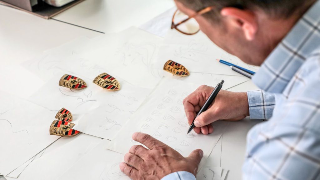
The German manufacturer took three years to come up with a modernised version of its iconic badge, teaming up with designers from Style Porsche and marketing experts to make sure it was done so carefully.
“The time factor is very important in a maturing process such as this,” says Joachim Paetzel, Specialist for Colour and Trim at Style Porsche.

So, what did the now 75-year-old brand come up with in that time? Well, nothing a whole lot different to be frank which is arguably a good thing.
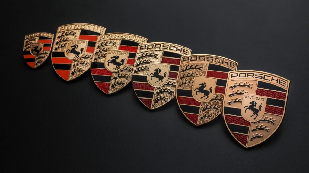
The textured background behind the “Porsche” inscription and antlers of the Württemberg coat of arms (the historical territory of Germany where Porsche is headquartered) have been replaced with a smooth backing, while the red stripes are now presented in a honeycomb appearance.
In the middle remains the horse from Stuttgart’s seal, but the city’s name is now highlighted in black.
Porsche has been using the crest design since 1952 and has updated it progressively over time in 1954, 1963, 1973, 1994 and 2008. The logo is immediately recognisable by many today and even with its latest revisions, remains so.

The marque was originally drawn by Franz Xaver Reimspieß who had apparently designed the Volkswagen logo in 1936.
Customers with older models who want to keep their cars period correct are still in luck too, as all of the brand’s historical logos can be ordered as original parts through Porsche Classic.
The newly-revised Porsche logo will appear on all of the brand’s online and physical branding before we see it on any cars at the end of this year.


