Citroen reveals new logo and brand identity
Words: Harrison Wade
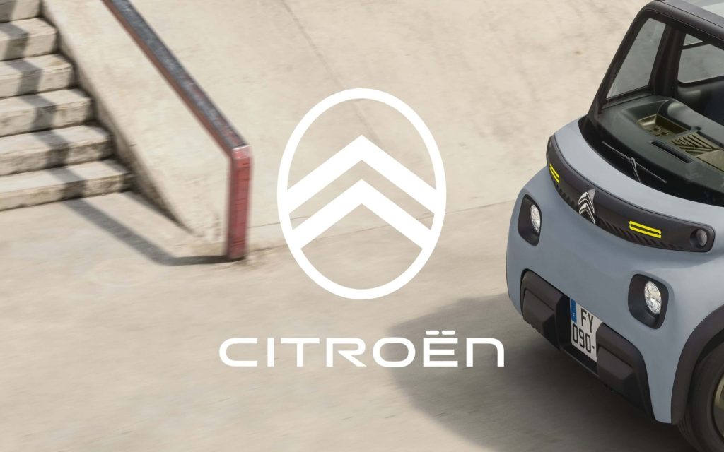
Citroen has revealed its fresh new look for the company in the form of a new logo alongside a new brand identity, preparing it for the modern era of electric mobility.
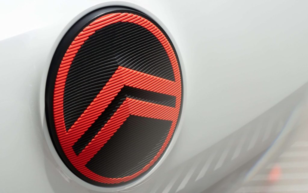
Inspired by the original 1919 design, the new logo features the familiar “deux chevrons” contained in an oval much like how founder Andre Citroen drew it 103 years ago.
New lettering sits underneath the logo while a fresh and simplified colour palette is said to help it stand out.

The new logo is set to debut at the end of September on a new concept car and will also make an appearance on future production and concept models from mid-2023.
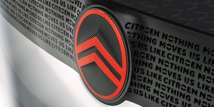
Alongside the fresh badge is a new tagline, “Nothing Moves Us Like Citroen”, which is said to have taken inspiration from “more intimate non-automotive brands” like cosmetics and apparel. Very French.
Of course, the newly updated logo and brand imagery will make an appearance on all customer and corporate touchpoints like its dealerships, signage and documentation.

“As we embark on probably the most exciting chapter in our illustrious 103-year history, the time is right for Citroën to adopt a modern and contemporary new look,” said Citroen CEO Vincent Cobee.
In addition to the reinvigorated brand look comes the reintroduction of Monte Carlo Blue and Infra-Red colours for its vehicles.


