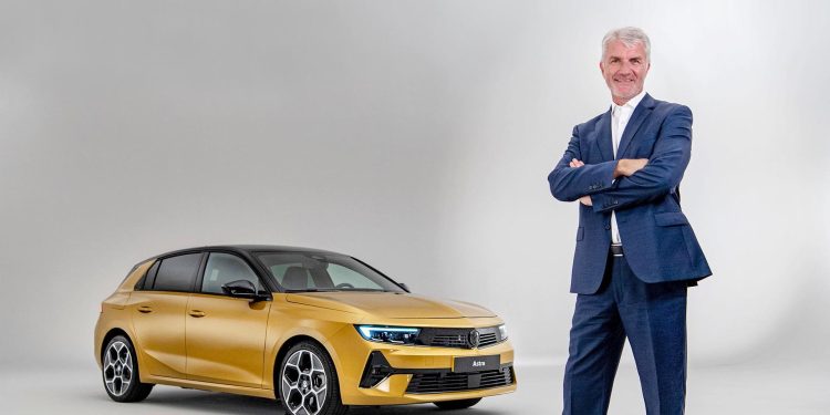
Opel Design: interview with Mark Adams
We talk to Mark Adams, the Vice President of Design for Opel, about the new styling direction he has implemented for the German brand and why he’s so excited about it.
Mark Adams has spent the past twenty years in the Opel styling studio, his first role in 2002 being head of exterior development for concept and production vehicles. He was responsible for the Insignia concept of 2003 and the subsequent production car. In 2007 he was named vice president for design and he has led the development of vehicles such as the Astra GTC, the second-generation Insignia, the 2013 Monza Concept and the 2016 GT Concept.
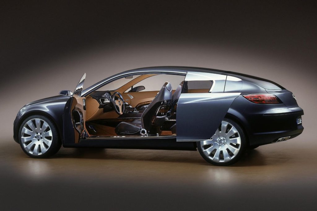
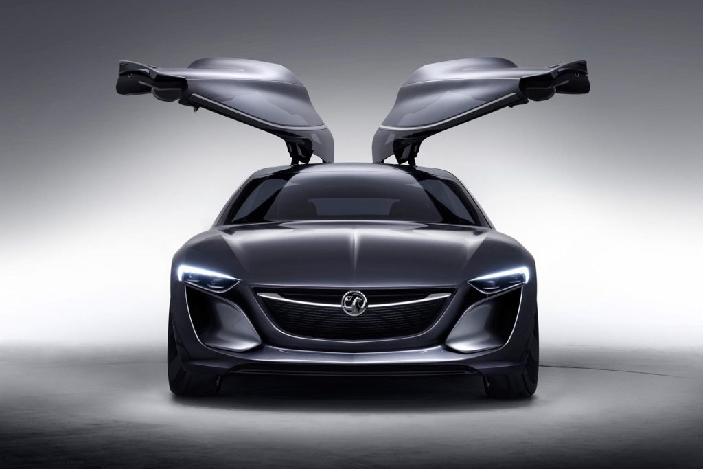
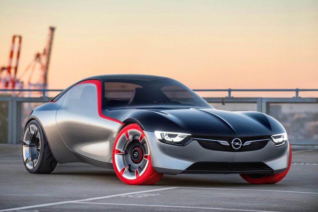
Where are you getting your inspiration and what’s driving the new design language?
Let me take you back a few years so you can understand the process we went through. The real trigger was the change in company ownership. Prior to becoming part of PSA and subsequently Stellantis, our designs were twinned with Buick. So we had a few handcuffs that didn’t allow us to do what we wanted to do as an individual brand.
When we became part of the PSA group we had the opportunity to be who we wanted to be. We are the only German brand within the overall portfolio and that is a very distinctive position within the group. Carlos (Tavares) personally said to me “Now you’ve got the freedom to define the brand from a design perspective”. I told my team that we had the chance to push the reset button. I said let’s go back and think about how we visually communicate those German brand values.
We spent a lot of time considering what constitutes German design. There are a lot of stereotypes that arise, such as quality and refinement but we see that there’s a much newer modern German twist happening. Germany is not all schnitzel and open sandals; there’s a much more progressive, youthful side to the country and we wanted to align ourselves with that.
So we came up with two words; Bold and Pure. They complement each other. Obviously we want to stand out, to be distinctive but purity was very important to us. It needed to be done in a very coherent, well structured way, a German way.
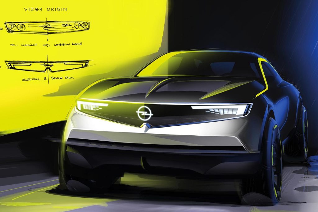
We started work on the face of the car, the face of the brand. When you see any car, the face of the brand is very important. So we did a lot of sketch work around that and I let the designers run free, except that the only framework they had was ‘Bold and Pure’.
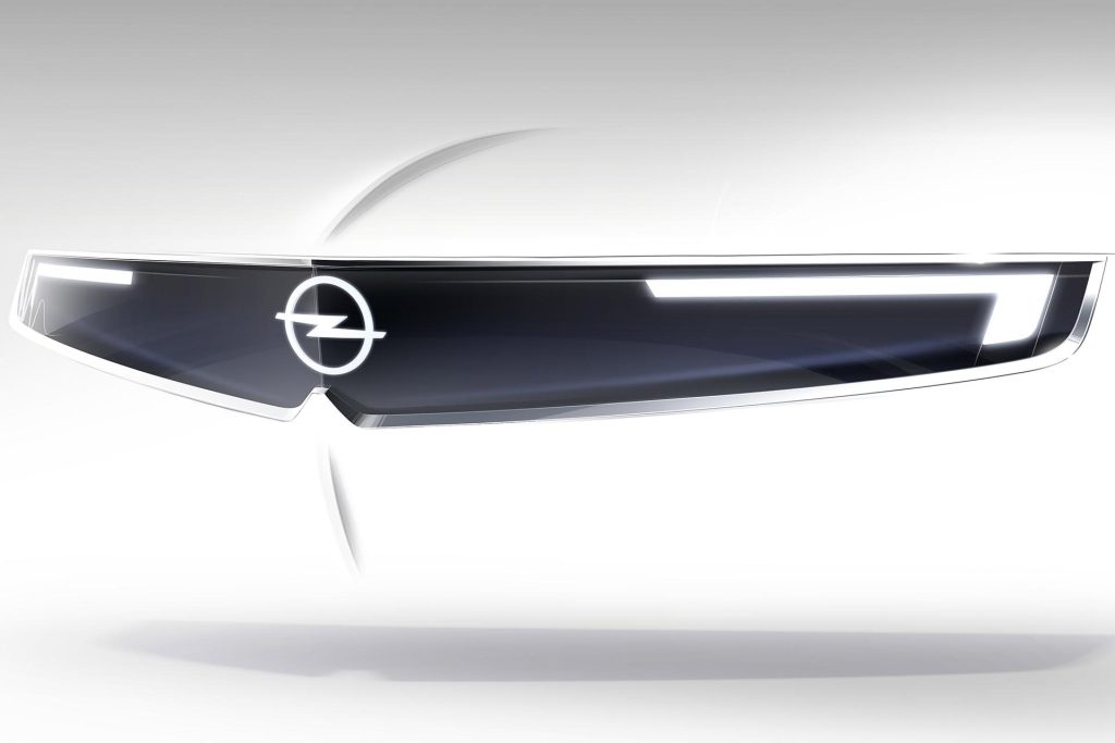
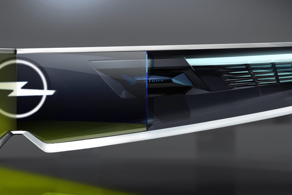
We have some genuinely iconic cars in our past, the Opel GT, the Manta A, the Calibre, and I would say we lost our way for a while but I wanted to get back to those iconic, distinctive cars. That’s how we came up with the Vizor, because the Vizor has a very simple graphic, it actually links back to the Manta A. But the big difference and what made it the real modern twist is that I wanted to make sure that it was future-proof. For example, as we add more sensors on the car (radar, cameras or Lidar), when you look at some cars today they’re peppered with sensors and all these different shapes are plastered over the front of the car. Our ideal vision was to corral them into a sort of tech hub, and that became the Vizor. The front end of our cars is very pure and at the same time very distinctive.
How much focus was put on aerodynamics?
A German car has to have great functionality and I would say that part of that functionality is aerodynamic performance because efficiency is key. Particularly as we get more and more electrified vehicles, range is impacted significantly by aerodynamics and so that was a vital part of our design execution. The cars had very tough aerodynamic targets. We did a lot of detail work in the wind tunnel and a lot of the fine tuning brings about the last 10 per cent of aero efficiency. So the design doesn’t change but the pulling and pushing of edges and surfaces really makes a difference.
A little example would be at the rear of our cars. The rear corners have a flowing shape but when you look closely at the tail lamps they have a really hard separation edge and the radius on our bumpers is done to create a separation edge for the aerodynamics. It’s the same for the back end of the C or D pillars, with more separation for aerodynamics. They’re not first glance things because the car has a more fluid and holistic feel but up close you start to see all these technical edges that have been developed specifically for aerodynamics. So great German design blends exciting design with true German function.
Sometimes you can put a shape into the wind tunnel and it can measure terribly but most people would not notice the difference between what went into the tunnel initially and the final production car. We’ve massaged surfaces and created edges to optimise it but the overall design doesn’t really look any different. It’s all about experience, skill, refinement and interactive work. It is a bit of a black art; you think you know a shape but you don’t know precisely how to present it until it’s been massaged. You have to try things out and experiment.
There’s a compass theme to it too?
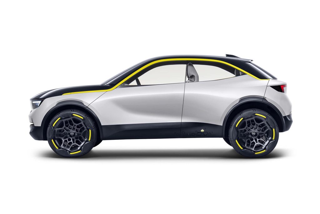
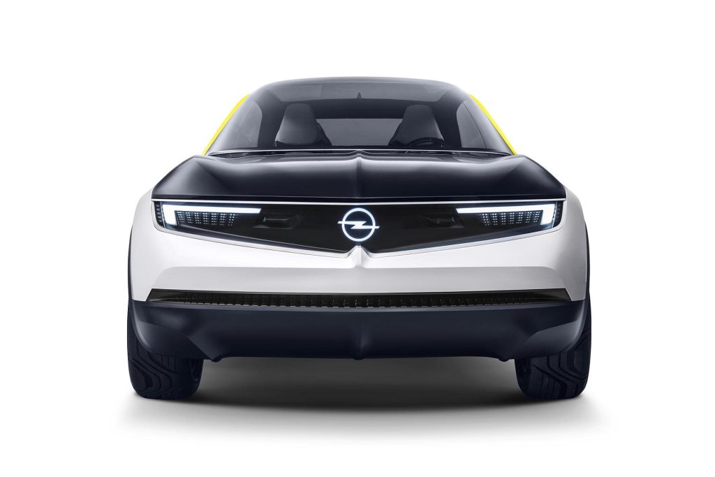
Going back to that time in 2017 when we redefined what we wanted to be, we created the GTX concept and if you look at that concept and the new production Mokka, it’s clearly the production execution of the GTX. And one of the things we talked about in the concept car was the idea of the compass. If you look at the front view of our cars, since the 1960s we as a brand have always had a crease running down the centre of our cars. What we’ve done is exaggerated this and it lines up with the emblem in the middle. So what you get are these vertical and horizontal elements meeting the emblem in the middle and we called that The Compass.
What about the interior?
We wanted to bring the word pure into our interiors as well. The pure panel in the new Astra for instance does give you this high tech interface but organised in a very logical way. So we’ve got a good combination of very clear and easy-to-understand graphics, the new human-machine interface operates in a very clear and simple way.
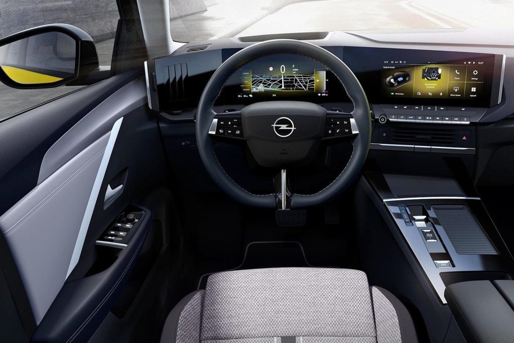
My principle for the interior was that the world is overly complex. People are bombarded with things on the internet, and we’re overburdened with electronics. What we wanted to do was to simplify things so when you sit in our cars the experience is the essence of purity.
We still have physical buttons for things like volume or heating and the reason for that is we wanted you to be able to get at them quickly, not buried in the third layer of a screen that means you take your eyes off the road. That’s fine with your phone because you can give it 100 per cent of your attention, but when you’re driving, our philosophy was ‘hands on the wheel, eyes on the road’. We want drivers to take their eyes off the road for the minimum amount of time to operate something.
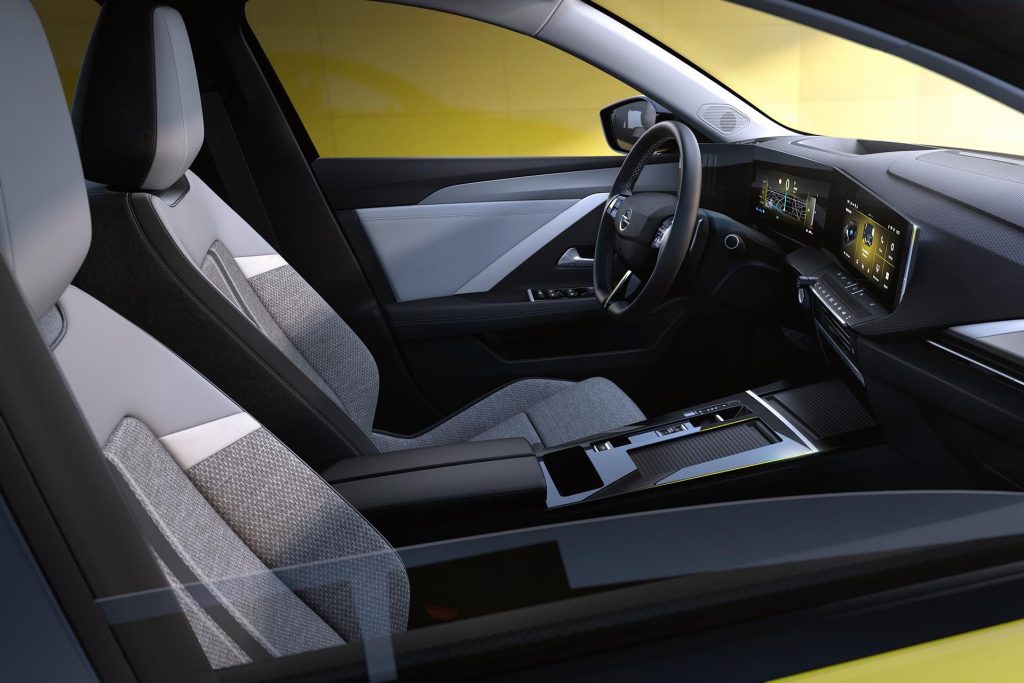
A simple detail that shows the level of care we took is that we have two sets of switches under the main central screen. In the middle of that area is a textured area to rest your thumb and it’s illuminated, so even at night it’s easy to find. Just resting your thumb makes the operation of the screen that much easier. More relaxed, more pure and less stressful.
Even the positioning of the screen in relation to the central cluster means the driver’s eyes don’t have to refocus. Again, it’s part of making the experience more relaxed. The interior is very important as it’s where you’ll spend most of your time. And the whole philosophy of bold and pure works all the way through.
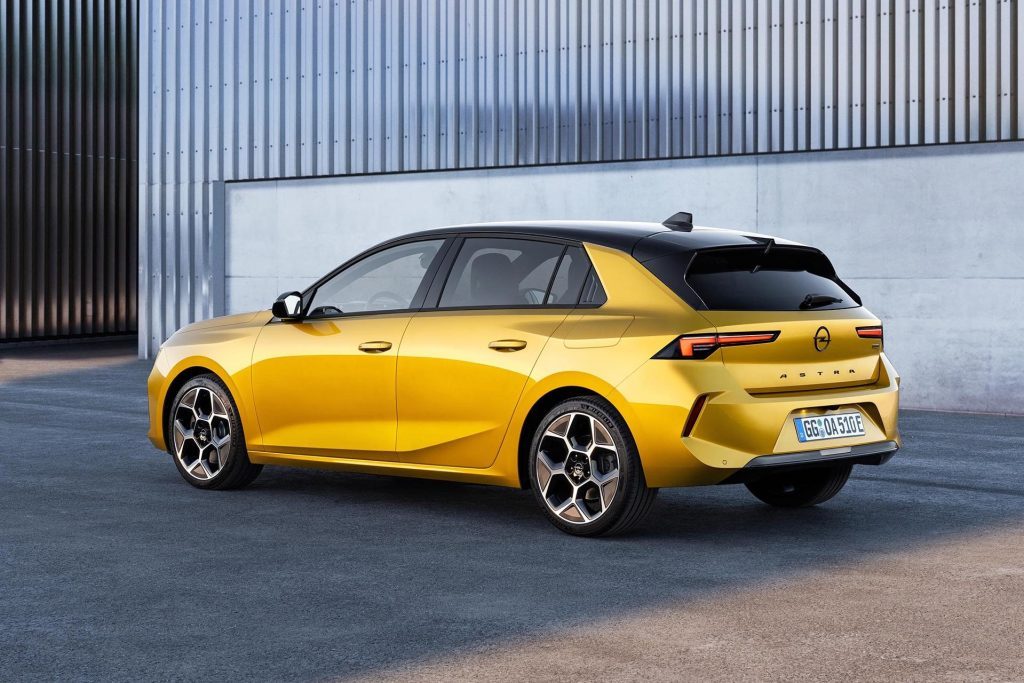
Opel is relaunching in New Zealand soon. Its initial line-up will include the Corsa-e, the Astra and Mokka and Grandland SUVs. The Mokka arrives first, priced from $38,990. The higher spec Mokka SRi will sell for $44,990, while both recieve a $1923 rebate. The Mokka-e is $69,990, and gets a $8625 rebate.


